Beyond Beige: The Art of Layering Tonal Color and Micro-Contrasts
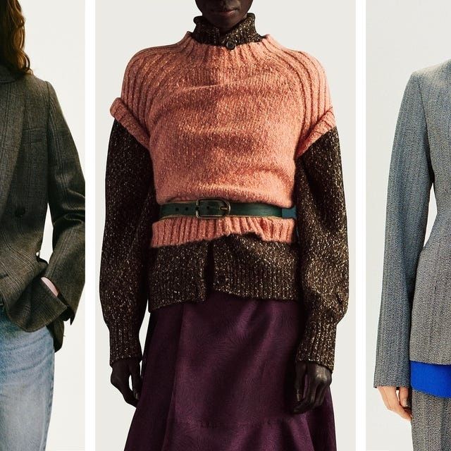
Rethinking Modern Minimalism Beyond the Neutral Palette
Modern minimalism has often been reduced to a familiar procession of oatmeal, cream, stone, and beige. These shades can be elegant, but when every garment shares the same quiet temperature and powdery finish, the wardrobe begins to lose its sense of structure. The eye has nowhere to pause, fabric surfaces become difficult to distinguish, and an outfit that was intended to look refined can appear visually unfinished. Understated dressing does not require the absence of color. It requires control.
A richer tonal palette offers that control without sacrificing restraint. Sapphire, teal, emerald, aubergine, moss, and softened rose can sit together with the same calm confidence as neutrals when their depth, saturation, and texture are carefully managed. The key is to treat clothing like a composed artwork: establish a dominant field, introduce neighboring hues, then build dimension through material and finish. With a few deliberate choices, dressing becomes less about collecting dramatic colors and more about arranging them with a craftsman”s attention to balance.
Understanding Value and Analogous Harmonies
Analogous colors sit beside one another on the traditional color wheel, sharing a visual family while differing enough to create movement. Blue, blue-green, and green form one useful sequence; red, red-violet, and violet form another. Because adjacent hues have related wavelengths and perceived temperatures, they generally produce a more coherent result than randomly selected contrasting shades. The geometry of the color wheel provides a useful foundation for understanding why these relationships feel connected rather than abrupt.
Color harmony depends on more than hue. Value describes how light or dark a color appears, while saturation describes its intensity. A deep emerald blazer, for example, can work beautifully with a muted teal knit and a pale celadon shirt because the colors remain related while their values create a readable hierarchy. The same emerald may feel excessive beside a highly saturated sapphire and brilliant turquoise if every piece competes at the same visual volume. Undertones matter as well. A blue with a slightly green cast will usually sit more comfortably beside teal than a blue with a distinctly violet cast.
Use the following groupings as practical starting points. They are not rigid formulas, but they provide a dependable framework for building color with restraint.
- Blue family Sapphire, ink, denim, teal, sea glass, and softened blue-gray.
- Green family Emerald, forest, moss, olive, jade, and pale celadon.
- Red and violet family Burgundy, ruby, aubergine, plum, mauve, and dusty rose.
- Warm earth family Rust, terracotta, ochre, camel, tobacco, and muted peach.
- Cool bridge shades Charcoal, slate, mushroom, soft white, and blue-gray, which can connect neighboring families without flattening them.
The Science of Micro-Contrasts in Textile Finishes
Two garments can share almost exactly the same color and still look dramatically different depending on their surfaces. A brushed wool absorbs light and appears quiet, dense, and grounded. Silk reflects light in narrow, shifting highlights, giving even a subdued shade a sense of movement. Glazed leather produces a sharper reflection, while suede diffuses light into a velvety haze. When identical tones are paired in identical finishes, these distinctions disappear, and the ensemble can look like a single unbroken block.
Micro-contrast solves that problem without requiring loud pattern or obvious color opposition. Pair matte wool trousers with a softly lustrous silk blouse, or place a compact cotton jersey beneath a dry linen overshirt. The tactile logic of this approach also supports the emotional character of an outfit. Soft surfaces can suggest ease and approachability, while structured or reflective materials introduce authority and polish. Historical Bauhaus investigations into the relationship between color and form provide a useful artistic parallel, particularly in the Bauhaus study of color and form.
| Pairing | Visual effect | Best use |
|---|---|---|
| Matte wool and silk | Grounded depth with a controlled glow | Tailored daywear and evening layering |
| Brushed cotton and glazed leather | Soft absorption against crisp reflection | Casual outfits that need sharper definition |
| Linen and fine-gauge knitwear | Dry openness balanced by compact softness | Warm-weather tonal dressing |
| Suede and polished metal | Velvety warmth with a precise accent | Accessories, footwear, and transitional looks |
| Corduroy and smooth poplin | Ribbed shadow against a clean surface | Relaxed, textural everyday combinations |
Layering Saturated Jewel Tones with Nuanced Pastels
Jewel tones are most effective when they serve as structural anchors rather than isolated flashes of color. A sapphire coat, emerald trouser, or deep plum skirt can establish the central weight of an outfit, giving softer surrounding shades something to support. Jewel tones are especially useful because their saturation makes simple silhouettes feel intentional. A straightforward knit, shirt, or tailored jacket can look considered when the color carries enough depth.
Pastels need not be sugary or obviously delicate. Look for desaturated versions of the same family: misted teal instead of bright turquoise, dusty lilac instead of electric violet, celadon instead of vivid green, or rose beige instead of clear pink. These softened tones allow the eye to travel gradually from dark to light. A muted pastel can also prevent a saturated base from becoming overly formal, making jewel-colored pieces more practical for daily wear.
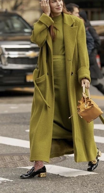
Build a multi-depth outfit in a deliberate sequence rather than adding color randomly.
- Choose the anchor. Begin with one substantial piece in a deep jewel tone, such as an emerald jacket, sapphire skirt, or aubergine trouser. This garment should carry the greatest visual weight.
- Select a neighboring middle tone. Add a related shade that is lighter or less saturated. A teal knit beneath emerald tailoring or a mauve shirt with plum trousers creates continuity without duplication.
- Introduce a pale transition. Use a softened tint near the face, at the hem, or in a visible underlayer. This creates breathing room and keeps the darker colors from forming a dense uninterrupted mass.
- Repeat one color in a small detail. Echo the anchor through a bag, sock, scarf, stone, or narrow trim. The repetition should be subtle enough to feel discovered rather than matched.
- Inspect the silhouette. Step back and check whether the color arrangement supports the shape of the outfit. If every strong shade is concentrated in one area, redistribute weight through footwear or an accessory.
Refining the Narrative Through Intentional Accents
Accessories act as punctuation in a tonal outfit. Hardware, footwear, eyewear, and bags can either clarify the palette or interrupt it. Brushed silver tends to reinforce cool sapphire, teal, and slate combinations, while antique brass can warm moss, rust, aubergine, and tobacco. This does not mean every metal must match. A deliberate mixture can add sophistication, but it should be repeated or visually balanced so it reads as a decision rather than an accident.
Spatial distribution is equally important. Vivid shades should not all gather around the face, hands, or feet. Let one saturated color occupy the largest area, allow a second related shade to appear in a supporting zone, and reserve the lightest or brightest note for a small point of emphasis. Evaluate the outfit in daylight and under indoor lighting, since silk, leather, and polished hardware can change considerably as the light source changes.
- Check whether one piece clearly leads while the other colors support it.
- Look for at least two distinct surface finishes, especially when the hues are closely related.
- View the outfit from several steps away to assess overall value, then inspect it close up for texture and finish.
- Photograph the combination in natural light and under warm artificial light before wearing it to an important event.
- Confirm that the footwear grounds the palette rather than introducing an unrelated visual temperature.
- Remove one accessory if the outfit feels busy. Restraint is often the final finishing technique.
Mastering Your Dynamic Daily Palette
A sophisticated wardrobe does not need to remain trapped inside a narrow neutral formula. Begin with one neighboring color relationship, then test it through different values and fabrics. A sapphire sweater with slate trousers is a gentle first step; adding a pale teal shirt and suede shoes introduces more complexity without abandoning coherence. As confidence develops, richer combinations can become as dependable as black, cream, or beige.
The most convincing tonal dressing feels lived in rather than engineered. Allow matte and luminous surfaces to disagree slightly, let a tailored piece meet something soft or relaxed, and use color repetition with a light hand. The result is not merely a more colorful wardrobe. It is a more expressive system, one in which harmony, tactile contradiction, and careful finishing create an authentic signature for everyday life.